Year In Review
The 2023 Quadrant of everything that happened in golf
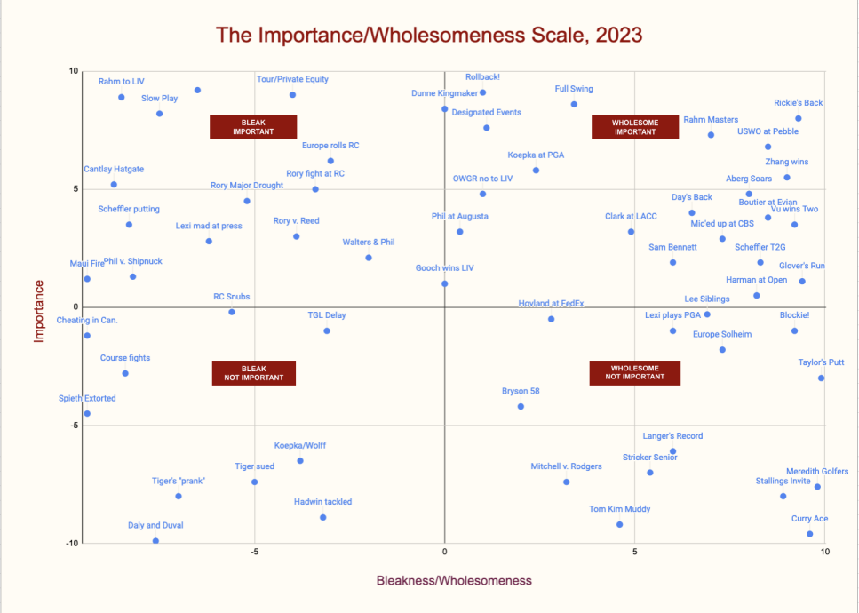
Hey there, you like quadrant charts? Maybe you liked the majors matrix we dished out a few months ago, where we measured the prestige of famous courses against the historic quality of the majors they hosted. Or maybe you're just a math guy, and you like seeing things in handy charts. In any case, we've undertaken the monumental task of assembling all the events we can remember from 2023 in the world of golf, and charting them based on two factors. First, importance—how much did it really impact the sport? Second, how wholesome or bleak was it? Did it symbolize everything that's wrong with our world and make you want to rip your hair out, or was it actually fun and enjoyable?
In the chart below, we document 60 of the biggest stories in golf from the past year, placing each within its proper quadrant. A couple quick notes before we unveil the result:
1.) Each axis runs from -10 to 10, with 0 as the exact neutral point. So if something is rated -10 on the importance axis, that means it was about as unimportant as you get, where a 10 means something akin to "extremely critical to the near future of golf." On the bleak to wholesome scale, the negative numbers (obviously) indicate something that gave us terrible vibes, while the higher you go, the more enriching it was.
2.) We didn't give anything an importance rating higher than 9.2, and this is 100% because we are sober analysts about the changing nature of the sport and unwilling to go to irresponsible predictive extremes...and not at all because Google Sheets charts cuts off the label of anything higher than 9.2 and we couldn't figure out how to fix it. Not at all!
3.) This is all for fun. If you disagree—good!
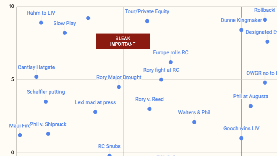
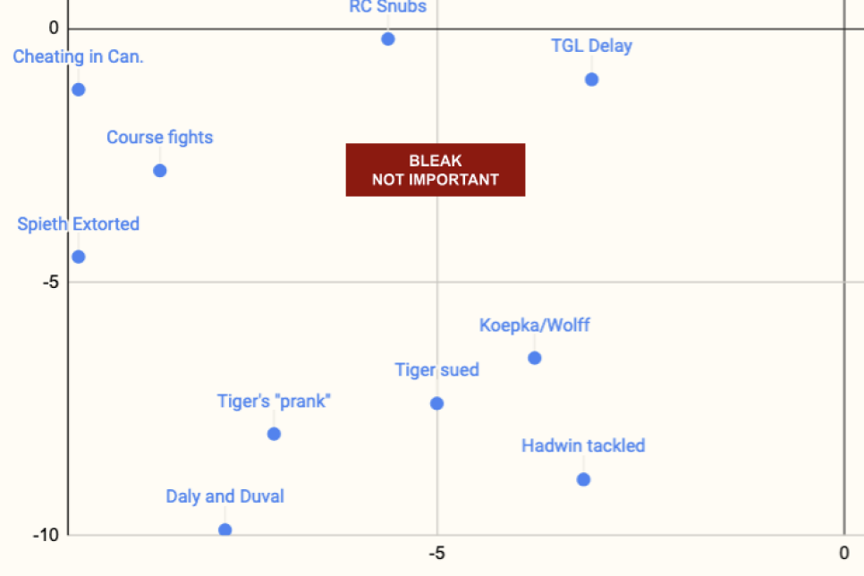
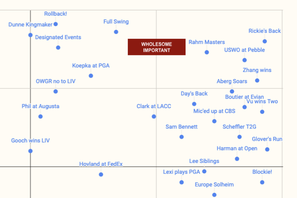
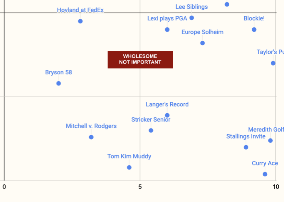
We had to shorten a few of the names to make them fit legibly on the chart, so if you want to see the full data, you can check out the spreadsheet below:


